Every year, I do a little summary of the American Society of Anesthesiologists Annual Meeting, with a focus on the increase in social media activity. This year, thanks to symplur.com, I have some really fun and informative visual data displays. Check it out:
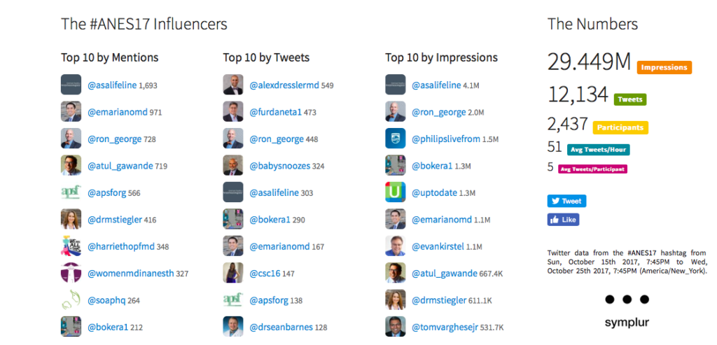
First, a pretty strong showing. Nearly 30 million impressions in the ten day period that encompass the entire meeting, as well as a few days leading up the big event. Remember that it is great to have more mentions relative to tweets, because that is an indication that other people are talking about you, instead of you doing all the talking. Impressions are influenced by a variety of factors – 3 of the keys here are how many followers you have, how many others retweet your content, and how many followers they have.
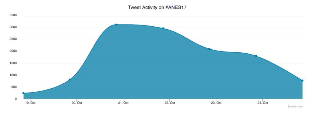 Not too surprising – the peak of the tweets corresponds to the days of the actual meeting, and are highest during the weekend portion.

Here, we can see that we are lagging waaaayyyy behind our surgical colleagues, who were also having their annual meeting at the same time. The American College of Surgeons Clinical Congress totally dominated. But, kudos to our pediatric specialists, who have not one, but two, related hashtags trending during the meeting.
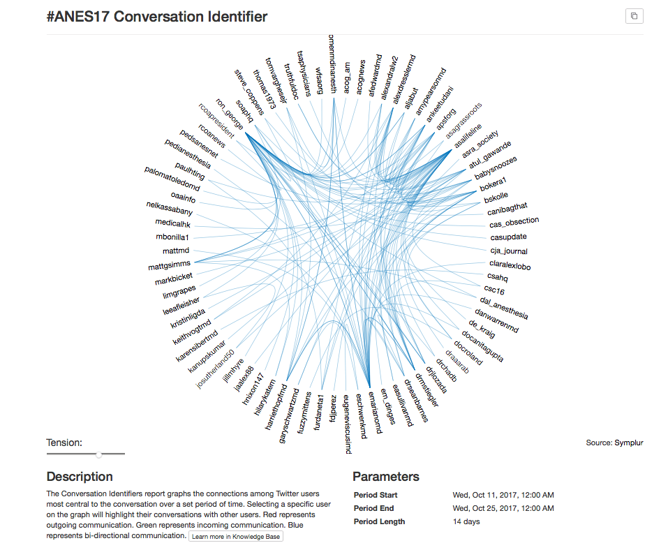
This fun visual shows just what the description indicates – a two week capture of conversations connecting Twitter users around the #ANES17 meeting. Note that the blue color is most prevalent, and that indicates bi-directional communication. See – we are team players!
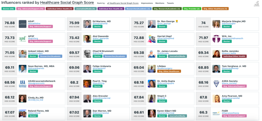
This is the Healthcare Social Graph Score – calculated by a variety of factors, including the magnitude of conversations in which the tweeter participates, plus their number of followers, and the influence and relevance of the folks who follow and retweet them. So, for example, if I say something that ASA or Atul Gawande thinks is great, it gives me a boost. In contrast, if I tweet something that Delta Airlines loves and tweets out to their tons of followers, that is neutral – they have little relevance to anesthesiology. (Note that the labels are automatically populated based on the software’s interpretation of the user’s bio – not mutually exclusive, and many of us are doctors, researchers, media figures, organizational leaders, etc.)
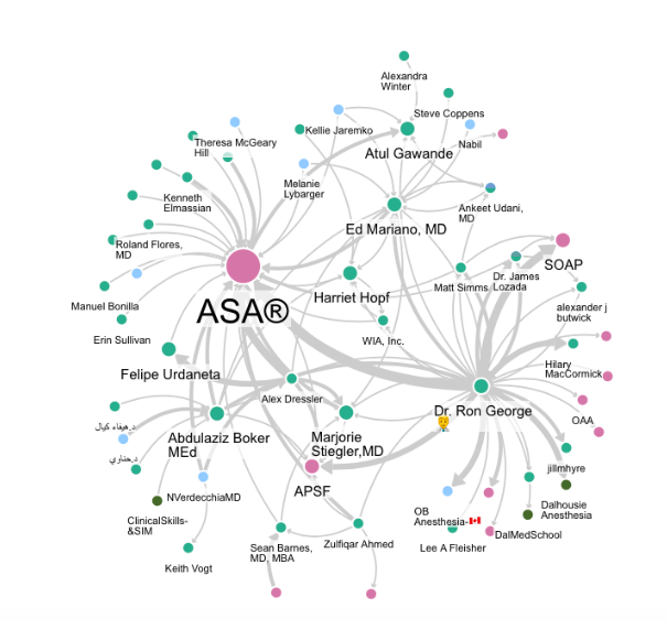
This one I just love – a visual of the direction of conversation, as well as the magnitude of the conversations among those using #ANES17. Obviously, not every single participant is mapped here, although we could zoom out and do that. The tradeoff would be a pretty crowded map that may not be as easy to digest.
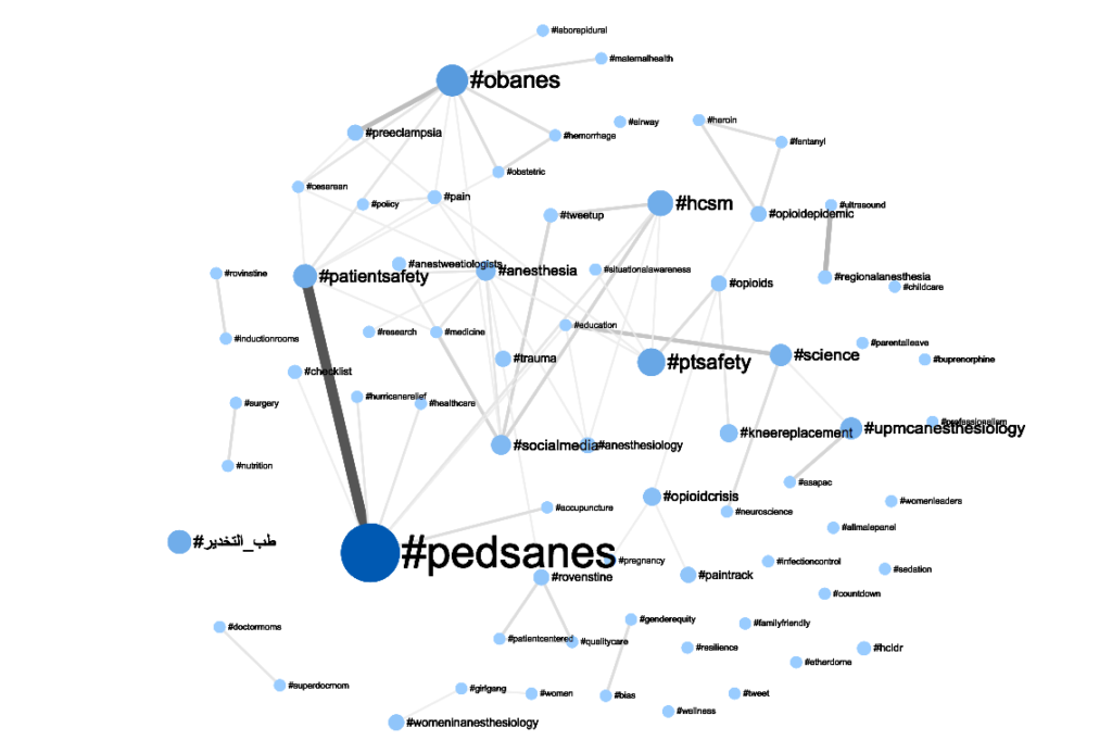
This is also very cool – a map of the hashtags that were used in the same tweets as the #ANES17 hashtag. We can see a few major themes, including patient safety, opioids, obstetric anesthesiology, healthcare social media (#hcsm), some institutions and organizations, and so on. As above, the pediatric anesthesiologists are really coming out – very strong showing!
Well, that’s it for now. If a picture is worth a thousand words, I certainly hope you enjoyed this post. Please let me know which of these displays you find most interesting and helpful!

